Operations Dashboard for Logistics Teams: 5-15 KPIs and MOTA Rules
An operations dashboard in logistics is a live, single-screen view of the KPIs that drive daily shipping decisions, built on the MOTA framework so every metric is measurable, owned, timely, and actionable. Its value is simple: it turns scattered freight data into a view your dispatch and warehouse teams can act on the moment something breaks. Platforms like some transport management systems build this visibility directly into the transport management system, instead of bolting it on after the fact.
TL;DR:
- Most critical KPIs should be directly linked to decisions and include on-time pickup and delivery rates, throughput, cycle time, and exception counts to predict and address issues early.
- Dashboard data must match decision-making cadence, with real-time or 15-minute updates for shipment tracking, and hourly or daily refreshes for financial metrics, to support timely actions.
- Every metric needs an owner and must pass the MOTA test, ensuring it is measurable, actionable, timely, and owned to prevent stale data and loss of trust.
- Proper data hygiene involves consistent identifiers, timestamp alignment, and validation rules to avoid inaccuracies that can mislead operators or erode dashboard credibility.
- Incorporating AI and predictive models shifts dashboards from reactive tools to anticipatory systems, highlighting likely delays or issues hours before they impact operations.
Table of Contents
- Types of Logistics and Operations Dashboards
- What KPIs Belong on an Operations Dashboard?
- How Fresh Should Your Dashboard Data Be?
- Design and Ownership: Putting MOTA to Work
- How to Build an Operations Dashboard: A Practical Checklist
- FreightSuite’s Approach to Operations Dashboards
- Common Pitfalls in Logistics Dashboard Implementation
- Keeping Logistics Dashboard Data Accurate and Clean
- Predictive Analytics and AI in Operations Dashboards
- How FreightSuite Helps You Build the Dashboard Your Operation Needs
- Sources
- FAQ
Types of Logistics and Operations Dashboards
Not every team needs the same view. An inventory dashboard answers “what do we have and where,” tracking stock levels, aging, and reorder points across warehouses. A transportation dashboard answers “where is everything right now,” pulling in-transit shipments, idle trucks, and delivery windows onto a map. A warehouse dashboard tracks dock-to-stock time, pick accuracy, and labor allocation. An end-to-end operations view stitches all three together for leadership.
Common dashboard groupings across the supply chain include inventory, transportation, order management, demand planning, and risk management views, each built to answer a different question rather than duplicate the same one.
Most effective layouts follow a consistent pattern:
- A map or flow view showing physical movement in real time
- Headline KPIs sized for a three-second scan
- An attention queue listing exceptions that need a human decision
A trucking-focused version of this layout puts revenue, AR aging, idle trucks, and compliance status on one screen, refreshed continuously, so the morning briefing writes itself.
What KPIs Belong on an Operations Dashboard?
Pick too few metrics and you miss problems. Pick too many and nobody looks at the screen at all. The working rule among logistics teams is to keep KPIs per dashboard within a moderate range, with a majority being leading indicators (metrics that predict trouble) and the rest lagging indicators (metrics that confirm it already happened).
The highest-value metrics for daily operations tend to be:
- On-time pickup and delivery rate
- Throughput (orders or shipments processed per hour)
- Cycle time from booking to delivery
- Work-in-progress (WIP) and backlog aging
- Accounts receivable aging
- Exception count (missed pickups, tracking gaps, documentation holds)
- Cost per mile or cost per shipment
Dashboards should surface step-level flow metrics like throughput, cycle time, WIP, and backlog aging so teams can isolate constraints before they become systemic.
Thresholds matter more than raw numbers. A 92% on-time rate means nothing without a target and a color band that tells the dispatcher when to intervene. Set the target first, then build the visual around it, not the other way around.
How Fresh Should Your Dashboard Data Be?
A dashboard is not a report, and treating it like one is the most common design mistake logistics teams make. A report is backward-looking and analytical; a dashboard is forward-leaning and tactical, meant to trigger a decision in the next few minutes, not summarize last month.
Refresh cadence should match the decision it supports. Dispatch and live shipment tracking benefit from continuous updates or 15-minute intervals, since a delayed pickup needs a reroute now, not tomorrow. Warehouse throughput and labor views work fine at 15 to 60 minutes; dock activity does not swing wildly minute to minute. Financial summaries, like AR aging or margin by lane, are appropriately refreshed hourly or daily.
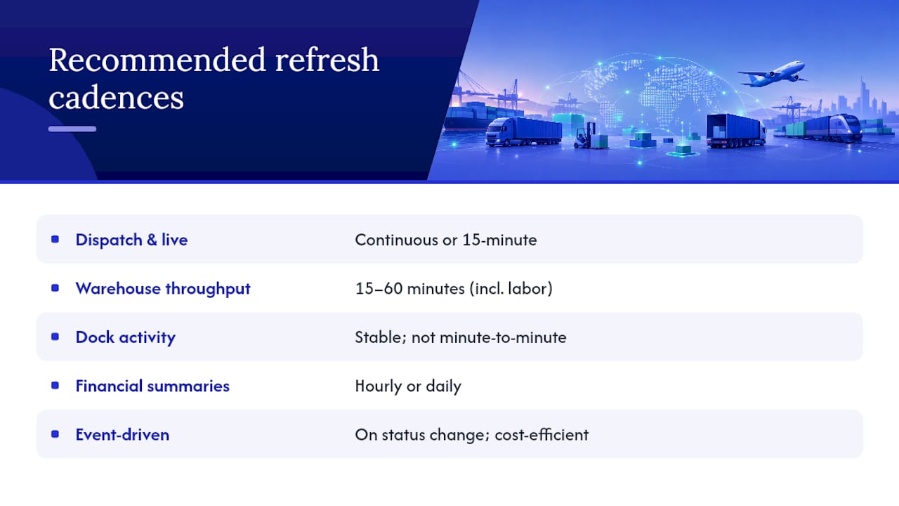
Faster is not automatically better. Continuous refresh costs more in integration complexity and infrastructure, so reserve it for KPIs where a 15-minute delay actually changes what someone does next. For everything else, event-driven updates (triggered when a status changes) balance freshness against cost more efficiently than polling every system on a fixed clock.
Design and Ownership: Putting MOTA to Work
The MOTA framework, Measurable, Owned, Timely, Actionable, is the filter that keeps a dashboard useful instead of decorative. Run every candidate metric through these four questions before it earns a spot on the screen:
- Is it measurable with data you actually have, not data you hope to have?
- Is it owned by one named person who is accountable for the number?
- Is it timely, updated on a cadence that matches the decision it informs?
- Is it actionable, meaning someone can change the outcome by acting on it?
Metrics without an assigned owner tend to go stale fast, because nobody feels responsible for questioning a number that looks wrong. Assign one owner and one clear decision to every KPI on the board.
Keep the whole dashboard scannable in a short time and limit the number of KPIs, use color thresholds instead of raw numbers, and give every metric a drill path so a supervisor can click from “on-time rate dropped” straight to the shipments causing it.
Pro Tip: Test your dashboard by handing it to someone outside the team for 60 seconds. If they can’t tell you what needs attention right now, the layout has too much noise.
How to Build an Operations Dashboard: A Practical Checklist
Standing up a working dashboard does not require a quarter-long project. It requires sequencing.
- Name an owner for each KPI before building anything
- Pick 5 to 15 KPIs and confirm each passes the MOTA test
- Map which system feeds each metric and confirm refresh cadence
- Build the attention queue first, then the headline KPIs around it
- Pilot with one team and review daily for two weeks
- Roll out role-based views for dispatcher, controller, warehouse, and finance
- Schedule a quarterly review to retire stale metrics and add new ones
Success in the pilot looks like fewer missed exceptions caught late and a shorter time between a status change and someone acting on it, not a longer list of charts.
FreightSuite’s Approach to Operations Dashboards
Some agentic TMS systems keep tracking, finance, and workflow data in one system rather than in three that need stitching together after the fact. That structure removes a lot of the integration lag that breaks dashboard accuracy elsewhere. Operations teams get air and ocean tracking, rate management, and financial reporting feeding the same view, with AI agents handling status updates so metric owners spend less time chasing data and more time acting on it.
Common Pitfalls in Logistics Dashboard Implementation
The most common failure is building the dashboard around available data instead of the decision it needs to support. Teams pull every field their TMS exposes, ship a screen with 40 metrics, and wonder why nobody opens it after week one. The fix is discipline at the KPI selection stage: if a metric does not change a decision, it does not belong on the board.
A close second is metric ownership drift. A KPI gets built, its owner changes jobs six months later, and nobody reassigns it. The number keeps updating, but nobody questions it when it looks wrong, and trust in the whole dashboard erodes even though only one metric actually failed.
Inconsistent status definitions across systems cause a quieter but equally damaging problem. If your WMS marks an order “complete” at pick and your TMS marks it “complete” at delivery, any dashboard blending both will show numbers that don’t reconcile with what either team experiences on the ground. Align these definitions before connecting a single data source.
Refresh mismatch is another frequent trap: teams either over-invest in continuous refresh for metrics that don’t need it, burning integration budget, or under-invest and use daily batch updates for dispatch decisions that need to happen in minutes. Match cadence to the decision, not to what’s technically easiest to build.
Finally, dashboards that never get revisited decay. KPIs that made sense during a peak season or a specific client ramp-up outlive their usefulness and clutter the screen long after they stopped driving decisions. A quarterly governance review, where owners defend why their metric still earns its spot, keeps the board lean and trusted.
Keeping Logistics Dashboard Data Accurate and Clean
Accuracy starts before the first chart gets built. Canonical identifiers, one shipment ID that means the same thing across your TMS, WMS, and carrier EDI feed, prevent the duplicate or orphaned records that quietly inflate exception counts and confuse root-cause analysis.
Timestamp alignment deserves equal attention. If your GPS feed reports in the vehicle’s local time zone and your TMS logs in UTC, a dashboard blending both will show cycle times that are wrong by hours, sometimes flipping which leg of a shipment actually caused a delay.
Validation rules catch errors before they reach the screen rather than after. Simple range checks (a shipment can’t have a negative transit time), required-field checks (a delivery can’t close without a timestamp), and duplicate detection on shipment IDs stop most bad data before it pollutes a KPI. Run these checks at the point of ingestion, not as a cleanup pass after the dashboard already shows the wrong number to a dispatcher making a real-time call.
Regular reconciliation between source systems and the dashboard layer catches drift that validation rules miss. A scheduled weekly comparison, pulling a sample of shipments and confirming the TMS, WMS, and dashboard all agree on status, surfaces integration bugs before they compound into a quarter of bad reporting.
Data hygiene is also a people problem, not just a technical one. If a warehouse team knows a “putaway complete” flag is unreliable, they’ll route around the dashboard entirely and go back to phone calls and spreadsheets. Fixing the underlying data source matters more than adding another chart on top of bad inputs. Assign the same owner accountable for a KPI’s accuracy as the one accountable for its target, so cleaning data and hitting numbers aren’t treated as separate jobs.
Predictive Analytics and AI in Operations Dashboards
The next layer beyond a live KPI screen is prediction. Instead of only showing that a shipment is delayed right now, predictive models flag which shipments are likely to miss their delivery window hours before it happens, based on patterns in transit time, carrier performance, and route history. That shift, from reactive to anticipatory, is where advanced logistics dashboards are heading.
AI agents are increasingly doing the work that used to require a person watching a screen. Instead of a dispatcher manually checking a tracking feed every 15 minutes, an agent can monitor the feed continuously, flag anomalies, and populate the attention queue automatically when a shipment falls outside its expected pattern. This matters because it changes what the dashboard is for: less a screen you check, more a system that checks itself and surfaces only what actually needs a human decision.
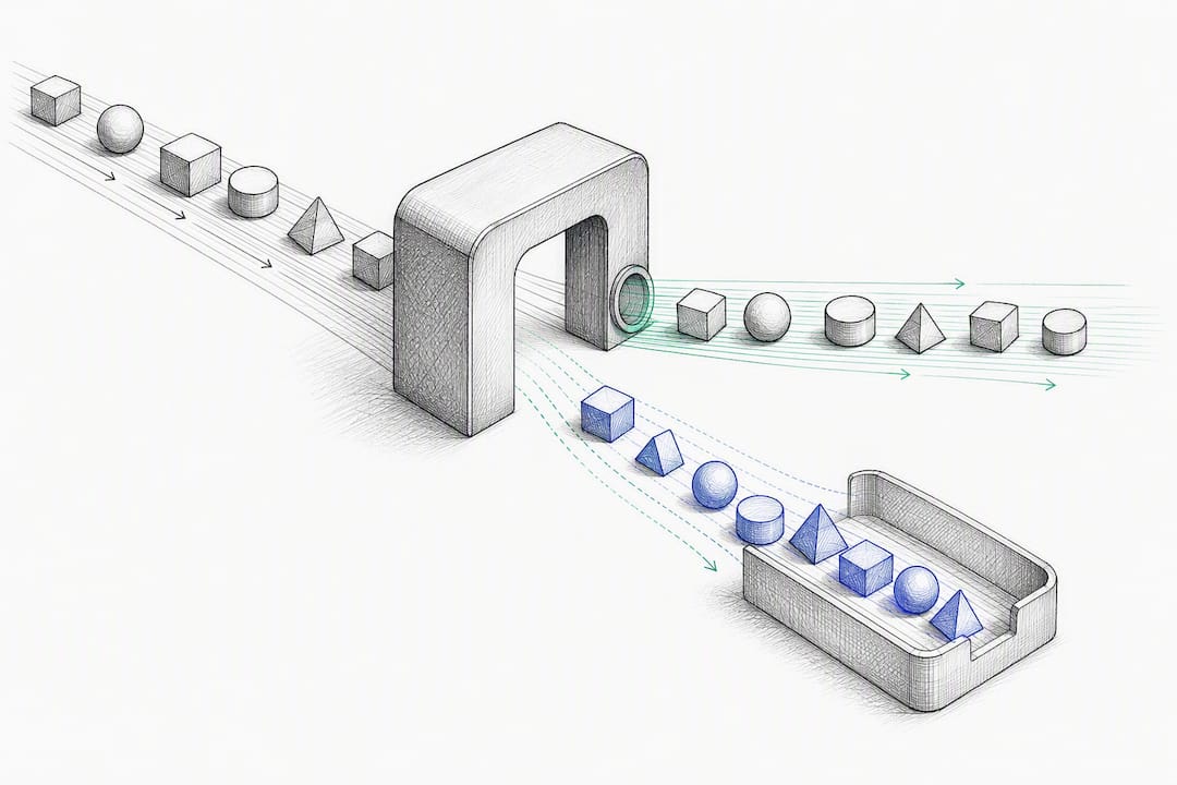
Other advanced features showing up in newer operations dashboards include automated exception routing (sending a missed-pickup alert to the right regional dispatcher instead of a general queue), dynamic threshold adjustment (tightening a KPI’s target automatically during peak season), and natural-language query layers that let a controller ask “which lanes had the worst on-time rate this week” instead of building a filter manually.
None of this replaces the fundamentals. A predictive model layered on top of bad timestamp data or unowned metrics just produces confident wrong answers faster. Get the KPI selection, ownership, and data hygiene right first, then layer prediction and automation on top.
How FreightSuite Helps You Build the Dashboard Your Operation Needs
Freight forwarders juggling separate tools for tracking, rates, and finance end up rebuilding the same dashboard logic three times, once per system, and reconciling the differences by hand. FreightSuite closes that gap by keeping rate management, tracking, and financial data inside one agentic TMS, so the KPIs on your screen come from a single source of truth instead of three exports stitched together overnight.
That structure matters most for AR aging and margin visibility, where finance teams need numbers that match what operations sees in real time. FreightSuite’s finance-focused tools pull directly from the same shipment data driving your operational KPIs, so a dispute over “which number is right” stops being a weekly occurrence.
If your team ships primarily by ocean, FreightSuite’s ocean freight tracking capabilities feed milestone data straight into your dashboard layer without a separate carrier integration project. For teams weighing fleet-side optimization alongside dashboard visibility, fleet optimization strategies for rental managers covers the operational side worth pairing with your tracking data.
The most direct next step is seeing it against your own shipment volume. Book a demo and bring your current KPI list. We’ll show you what it looks like running on a system built to keep the data behind it current, not reconciled after the fact.
Sources
An operations dashboard is only as good as the systems feeding it. The core sources most logistics teams connect are:
- Dashboard vs report: choosing the right BI tool for your data needs | Domo
- 7 Key supply chain dashboard examples | GoodData
- Operations dashboard for throughput and cycle time | Fusedash
- Trucking operations dashboard — Live KPI control room | Keelway
Integration usually happens through direct connectors, event streams, or scheduled ETL pipelines, with vendor tooling increasingly offering no-code connections between these systems and the dashboard layer. Whichever pattern you use, align timestamps and status definitions across sources first. A “delivered” flag in one system that means something different in another is the fastest way to make a dashboard lie to its users.
FAQ
What Is an Operations Dashboard?
An operations dashboard is a live, single-screen display of the metrics a team needs to make decisions right now, built to be forward-leaning and tactical rather than a backward-looking summary like a traditional report.
What Are the 5 P’s of Logistics?
The 5 P’s commonly cited in logistics are product, price, promotion, place, and people, a framework borrowed from marketing and adapted to describe the factors shaping supply chain strategy; definitions vary somewhat by source, so treat it as a general lens rather than a fixed standard.
How Do You Create a Logistics Dashboard?
Start by naming an owner for each KPI, select 5 to 15 metrics that pass the MOTA test, map each metric to its data source and refresh cadence, then pilot the layout with daily reviews before rolling it out to other teams.
How Do You Create a PMO Dashboard?
A project management office dashboard follows the same core logic as an operations dashboard: pick a small set of owned, measurable metrics tied to project status and risk, set a review cadence that matches decision speed, and build an attention queue for items needing escalation.
How Many KPIs Should an Operations Dashboard Show?
Most effective logistics dashboards hold between 5 and 15 KPIs, with roughly 60% leading indicators, since a dashboard with more than 15 metrics typically takes longer than three minutes to read and buries the signals that need action.

