Automate Lane Level Carrier Scorecards in 7 Steps for Logistics Teams
Carrier performance scoring is the discipline of grading carriers against a short, documented set of business-tied metrics, pulled from systems of record rather than self-reported summaries. The single most important action to start is narrow: pick 3 to 4 KPIs like OTIF and tender acceptance, write the exact formula for each, and connect data feeds to your TMS or EDI instead of carrier PDFs. That approach, backed by practical scorecard build guidance, turns a spreadsheet exercise into something that survives past one quarter.
TL;DR:
- Accurate scorecards should focus on 3 to 4 high-impact KPIs like OTIF, tender acceptance, claims ratio, and billing accuracy, all mapped to system records.
- Data verification should rely on system records such as TMS execution logs, POD timestamps, and claims logs, not carrier self-reported figures.
- Building and automating the scorecard within a modern TMS ensures data consistency, reduces manual work, and supports continuous improvement cycles.
- Lane-level scoring exposes variations hidden by overall carrier averages, enabling targeted improvements for specific routes or modes.
- Regular review cadences, from weekly alerts to annual assessments, sustain carrier performance improvements and inform procurement or routing decisions.
Table of Contents
- What KPIs Belong on a Carrier Scorecard?
- How Do You Build a Carrier Scorecard Step by Step?
- Where Should Scorecard Data Actually Come From?
- How Do You Set Weights and Scoring Bands?
- Why Lane Level Scoring Beats a Single Carrier Average
- Setting a Review Cadence That Actually Drives Decisions
- The Mistakes That Quietly Kill a Scorecard
- How a Modern TMS Turns This Into a Production System
- How Carrier Scorecards Fit Into Continuous Improvement
- Why Qualitative Feedback From Shippers and Receivers Still Matters
- Building Dashboards That Make Scores Usable
- Cleaning Up Data Discrepancies Before They Corrupt the Score
- Ready to Move Off Spreadsheets and Into a Real Scorecard?
- Sources
- FAQ
What KPIs Belong on a Carrier Scorecard?
A scorecard earns its keep when every metric on it maps to a business decision. Too many logistics teams build a 15 line dashboard nobody reviews, then quietly abandon it by month three. Keeping the list to 3 or 4 high impact metrics is what makes monthly review sustainable.
On time in full (OTIF) is the anchor metric for most freight operations. You have two legitimate ways to calculate it: count based (loads delivered on time and complete divided by total loads) or event based (matching appointment windows to actual POD timestamps). Pick one method and document it in writing, because switching definitions mid-year makes trend data useless.
Tender acceptance rate measures how often a carrier accepts tenders you offer them, and it needs to be tracked by lane, not just network wide. A carrier that accepts 95% of tenders on a strong lane but 60% on a thin one will hide that gap in a blended average.
Damage and claims ratio can run as an incident count (claims per 1,000 shipments) or a dollar exposure figure (claims value divided by freight spend). Larger shippers often want both, since a low incident count can still mask a handful of expensive losses.
Billing accuracy compares each invoice line against the rate card stored in your TMS, flagging discrepancies in fuel surcharges, accessorials, and base rates before they hit accounts payable.
| Metric | Formula | Typical Data Source |
|---|---|---|
| OTIF | On time, complete deliveries ÷ total deliveries | TMS execution records, POD timestamps, |
| Tender acceptance | Tenders accepted ÷ tenders offered (by lane) | TMS/EDI responses |
| Damage/claims ratio | Claims (count or $) ÷ total shipments or freight spend | Claims log, insurance records |
| Billing accuracy | Invoice lines matching rate card ÷ total invoice lines | TMS rate card, AP system |
Optional add ons like dwell time, communication responsiveness, or capacity commitment fill rate belong on the scorecard only once the core four are running cleanly and reviewed monthly.
How Do You Build a Carrier Scorecard Step by Step?
Building a working scorecard is a sequencing problem before it is a metrics problem. Get the order wrong and you end up automating a bad formula.
- Confirm data readiness. Pull 6 to 12 months of shipment level history and check that you have at least 10 to 15 loads per carrier per lane before scoring, since smaller samples produce noisy, misleading grades.
- Select 3 to 4 metrics and lock the formulas. Write down the exact calculation for each, including how partial deliveries or disputed claims get treated.
- Set minimum load thresholds. Carriers below the threshold get flagged as “insufficient data” rather than scored, so one bad load doesn’t tank a thin lane’s average.
- Map each metric to a specific field in your TMS or EDI feed. OTIF pulls from POD timestamps, not a carrier’s self-reported delivery log.
- Set weights, bands, and lane level rules. Decide whether scoring happens at the carrier level, the lane level, or both.
- Automate the pull. Connect the scorecard to your TMS or EDI feed directly and skip manual carrier submitted reports entirely.
- Share the results and tie them to tenders. A scorecard that never reaches a carrier or a procurement decision is just a report nobody acts on.
Pro Tip: Run your first scoring cycle in parallel with your old process for one full quarter before retiring anything. It catches formula errors before they influence a real tender award.
Where Should Scorecard Data Actually Come From?
The fastest way to kill a scorecard’s credibility is to score carriers on numbers they submitted themselves. Automated scorecards that pull continuously from systems of record eliminate that conflict of interest and cut the manual reconciliation work your ops team would otherwise absorb every month.
Three sources should carry the real weight:
- TMS execution records for tender status, pickup and delivery events, and exception codes.
- POD timestamps captured at delivery, not carrier reported ETAs, for OTIF accuracy.
- Claims logs maintained by your risk or insurance team, cross-referenced against shipment IDs for the damage ratio.
Billing accuracy needs its own reconciliation step: match each invoice line item against the rate card your TMS already holds for that carrier and lane, flagging any variance before payment, not after. Parcel volume in the United States remains substantial enough that manual invoice checking at scale is simply not viable for any shipper moving meaningful freight.
Your automation checklist should cover four things: connectors into your TMS and EDI feeds, field level mapping so “delivered” means the same thing across every carrier, reconciliation rules for when two systems disagree, and a named owner responsible for fixing broken feeds. A connector strategy for consolidating multi-carrier tracking data removes the PDF bottleneck entirely, which is where most manual scorecards eventually break down.
How Do You Set Weights and Scoring Bands?
Weights should reflect what actually costs you money. A common starting template runs OTIF at 35 to 40%, damage and claims at 20 to 25%, billing accuracy at 15 to 20%, and tender acceptance at 15%, though these weights need adjustment based on your freight profile. A cold chain shipper weights claims heavier; a high volume parcel program leans harder on OTIF.
Bands turn a number into a decision. A workable structure:
- Preferred: eligible for volume increases and first look on new lanes.
- Approved: standard routing guide inclusion, no special conditions.
- Probationary: corrective action plan required, volume capped.
- Inactive: removed from the routing guide pending remediation.
| Tier | Score Range | Typical Action |
|---|---|---|
| Preferred | above 85 | Volume growth, first look on new lanes |
| Approved | 75 to 85 | Standard routing, no restrictions |
| Probationary | 60 to 74 | Corrective plan, capped volume |
| Inactive | Below 60 | Removed from routing guide |
Why Lane Level Scoring Beats a Single Carrier Average
A carrier can post a strong network average while quietly failing on the exact lane you route the most volume through. Averaging hides that. Scoring per lane rather than only per carrier surfaces the variation that actually affects your service levels.
Ocean and rail modes make this even more visible. Global schedule reliability dropped month over month in mid 2026, and that kind of swing rarely hits every trade lane evenly.
- Score at the lane and mode level wherever volume supports it, and roll up to a carrier average only for executive reporting.
- Apply the same 10 to 15 load minimum per lane before displaying a score, flagging thin lanes as unscored rather than guessing.
- Show lane level breakdowns in dashboards and quarterly business reviews so procurement sees exactly where a carrier is strong or weak, not just a blended number.
Setting a Review Cadence That Actually Drives Decisions
A scorecard nobody reviews on a schedule is a spreadsheet with good intentions. Build the cadence around who needs to act, not just who wants to see the number.
- Weekly: automated exception alerts for missed OTIF or unmatched invoices, routed to ops.
- Monthly: operational check ins between your team and each strategic carrier.
- Quarterly: formal QBRs with evidence, corrective action plans, and follow-up metrics.
- Annual: scores feed directly into procurement and routing guide decisions.
Assign a clear scorecard owner (usually ops or procurement), with finance owning billing accuracy inputs. Pro Tip: Bring three things to every QBR: the lane level breakdown, the trend line over the last two quarters, and one specific corrective action with a deadline attached.
The Mistakes That Quietly Kill a Scorecard
Most scorecard failures trace back to a handful of repeatable errors, not bad intentions.
- Trusting carrier-submitted OTIF without cross-checking your own TMS. A carrier grading its own homework is not a scorecard, it’s marketing.
- Tracking too many metrics. Beyond 3 to 4 KPIs, monthly review time collapses and the scorecard stops getting used.
- Skipping minimum load thresholds. One bad delivery on a five load lane shouldn’t swing a carrier’s entire grade.
- Leaving data pulls manual with no named owner. Automation without accountability degrades within two quarters as feeds break silently.
How a Modern TMS Turns This Into a Production System
Everything above assumes you can actually get clean, automated data out of your systems, and that’s exactly where most legacy setups fall apart. Some modern TMS systems are built with execution records, invoice reconciliation, and rate management natively connected, so the scorecard isn’t a side project bolted onto a spreadsheet.
- Execution records capture tender responses and delivery events automatically, feeding OTIF and acceptance rate without manual entry.
- Invoice reconciliation matches billing lines against the stored rate card in real time, catching accuracy issues before payment.
- Rate management keeps the baseline every carrier is measured against current and auditable.
- AI agent orchestration flags exceptions and anomalies as they happen instead of surfacing them a month later in a QBR.
| Scorecard Requirement | FreightSuite Capability |
|---|---|
| Automated OTIF tracking | Execution records with POD timestamps |
| Billing accuracy | Native invoice-to-rate-card reconciliation |
| Lane-level visibility | Operations dashboards by lane and mode |
| Exception alerting | AI-assisted anomaly flagging |
Embedding the scorecard inside the same system that runs your operations shortens the loop between a missed delivery and a routing decision, which is the entire point of scoring carriers in the first place.
How Carrier Scorecards Fit Into Continuous Improvement
A scorecard that only produces a monthly PDF is a report, not a program. The shift happens when scores become an input to a recurring improvement cycle rather than a static grade.
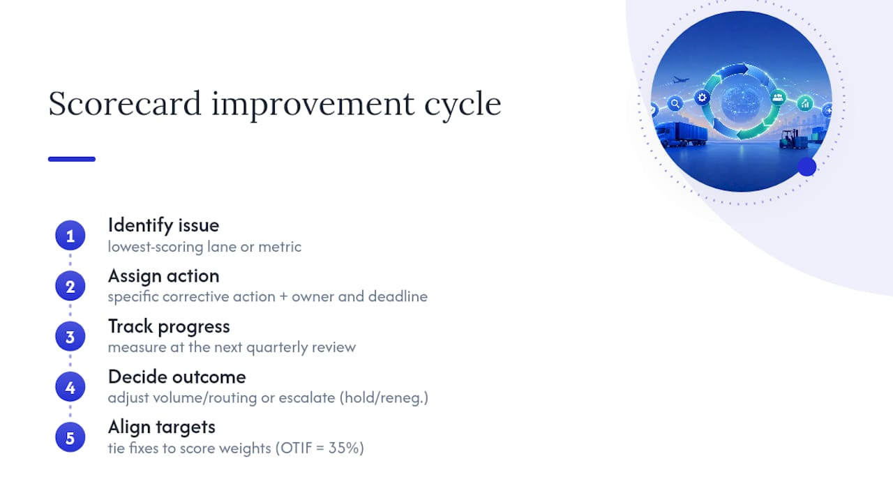
That means treating each quarterly review as a checkpoint in a longer loop: identify the lowest scoring lane or metric, assign a specific corrective action with an owner and deadline, track it at the next review, and only then adjust volume or routing. Carriers on probation should have a documented improvement plan with two or three measurable checkpoints, not a vague warning to “do better.”
The insight that matters here: scorecards work best when the output feeds directly into procurement events and tender awards, not just an internal ops report that never leaves your inbox. If a carrier’s billing accuracy stays below your threshold for two straight quarters, that should trigger a real conversation about a payment hold or contract renegotiation, not just another flagged line on a dashboard.
Tie improvement targets to the same weights you use for scoring. If OTIF carries 35% of the score, a carrier’s improvement plan should lead with OTIF specific fixes, whether that’s dispatch timing, driver availability, or appointment scheduling on your side. Continuous improvement only works when the metric that triggered the concern is the same metric you’re tracking to confirm it’s fixed.
Why Qualitative Feedback From Shippers and Receivers Still Matters
Numbers tell you what happened. They don’t always tell you why, or how it felt to the people managing the shipment on the ground. Dock receivers, warehouse teams, and shipping coordinators catch issues that never make it into a claims log, like a driver who consistently shows up without proper paperwork or one who communicates delays before they become missed appointments.
Build a lightweight feedback channel, a short monthly form or a standing agenda item in ops meetings, where receivers flag carrier issues in their own words. This qualitative layer catches two things scores miss: near misses that didn’t become claims, and communication quality that never shows up in a formula.
Weight this feedback carefully. It shouldn’t override your documented KPIs, but it should influence the probationary tier conversation. A carrier sitting right at the line between approved and probationary, with three separate receiver complaints about communication in the same quarter, deserves a harder look than the score alone suggests. Log this feedback in the same system as your quantitative data so it shows up in the QBR discussion, not as a side conversation that gets forgotten.
Building Dashboards That Make Scores Usable
A scorecard that lives in a quarterly PDF gets reviewed four times a year. A dashboard that updates automatically gets checked constantly, and that difference in visibility is what actually changes carrier behavior.
Effective dashboards separate views by audience. Ops needs a real-time exception view: which carriers missed OTIF this week, which invoices are flagged for mismatch. Procurement needs a trend view: score movement over the last four quarters, lane level breakdowns, and tier changes. Finance needs a billing accuracy view tied directly to payment holds and dispute status.
Resist the urge to cram every metric onto one screen. A dashboard with 20 charts gets ignored the same way a 20 line spreadsheet does. Build three focused views instead of one crowded one, and make sure lane level detail is one click away from the carrier level summary, not buried three menus deep.
Color coding matters more than it seems. Consistent use of the green, amber, red bands from your scoring tiers, applied identically across every dashboard view, means anyone glancing at the screen understands carrier status without reading a single number.
Cleaning Up Data Discrepancies Before They Corrupt the Score
Every scorecard eventually runs into a data fight: the carrier’s delivery timestamp doesn’t match your TMS record, or a claim got logged against the wrong shipment ID. How you resolve these disagreements determines whether your team trusts the score at all.
Set a reconciliation rule before you need one. A common approach: your TMS’s POD timestamp is the system of record for OTIF, full stop, and a carrier dispute gets a 5 business day window to submit documentation before the score locks for that period. Document this rule and share it with carriers up front, so disputes don’t become ad hoc negotiations every month.
Bad shipment ID matching is the most common source of claims ratio errors. If your claims log and TMS use different ID formats, build a mapping table rather than relying on someone manually cross-referencing spreadsheets. It’s tedious to set up once and saves hours of monthly cleanup afterward.
Finally, audit your data quarterly, not just your scores. Pull a random sample of 20 to 30 shipments and manually verify that the automated feed captured the right OTIF outcome, the right invoice match, and the right claims linkage. Small mapping errors compound quietly, and a quarterly spot check catches them before they’ve skewed six months of trend data.

Ready to Move Off Spreadsheets and Into a Real Scorecard?
Everything covered here, the formulas, the automated feeds, the lane level scoring, the reconciliation rules, is genuinely hard to sustain in a spreadsheet no matter how disciplined your team is. There are TMS solutions designed as alternatives to running scorecards on manual exports and carrier PDFs: execution records, invoice reconciliation, and rate management can live natively inside the same TMS, so the data feeding your scorecard is the same data running your operations, not a separate export someone has to remember to pull.

That matters most at renewal time, when procurement needs a defensible, automated record of carrier performance instead of a hastily assembled quarterly report. Freight forwarders using FreightSuite get scorecard-ready data on road freight, air freight, and ocean freight lanes without building a parallel reporting layer. Check the FreightSuite pricing page and request a demo to see how your own carrier data would look inside a live scorecard before your next tender cycle.
Sources
- How to build a carrier scorecard in 7 steps
- Parcel shipping volume in the United States
- Sea-Intelligence GLP press release
- Automated Carrier Performance Scorecards | FourKites
- Carrier scorecards give transportation teams a cleaner way to review performance
FAQ
What Is Carrier Performance Scoring?
Carrier performance scoring is the practice of grading carriers on a documented set of KPIs, typically OTIF, tender acceptance, claims ratio, and billing accuracy, pulled from TMS or EDI data rather than carrier self-reports.
How Many KPIs Should a Carrier Scorecard Have?
Most effective scorecards use 3 to 4 high-impact KPIs, since larger metric sets tend to get abandoned within a few review cycles due to review overload.
What Is a Good Minimum Load Threshold for Scoring?
A common guideline is 10 to 15 loads per carrier per lane per review period; carriers below that threshold should be flagged as insufficient data rather than scored.
How Often Should Carrier Scorecards Be Reviewed?
Use a tiered cadence: weekly exception alerts, monthly operational check-ins, quarterly formal business reviews, and annual procurement decisions tied to routing guide changes.
Can a TMS Like FreightSuite Automate Carrier Scorecards?
Yes. FreightSuite pulls execution records, POD timestamps, and invoice reconciliation data natively, which removes the manual PDF collection step that causes most scorecards to fail.
Should Carrier Scores Be Calculated by Carrier or by Lane?
Score by lane wherever volume allows it, then roll lane scores up into a carrier average for executive reporting, since carrier-level averages can hide serious lane-specific problems.

